Introducing: Svenja Ryan

Written by Svenja Ryan:

My name is Svenja. I am currently a PhD student in physical oceanography at the Alfred Wegener Institute, Helmholtz Centre for Polar and Marine Science in Bremerhaven, Germany and my work is actually very much related to the experiments which we will perform on the Coriolis platform. Even though I will not use the data myself, I am very excited to be part of the team in Grenoble.
I did my Bachelor (Physics of the Earth’s System) and Master (Climate Physics) degree in Kiel, Germany, where the University of Kiel and the GEOMAR have
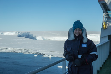
a great joint program. From the beginning on I was drawn to the field of oceanography as the vast oceans fascinate me and there is still so much left to explore. During my Bachelor I had the chance to participate in a research cruise to Antarctica for the first time; a place that is truly breathtaking. So, I went again a second time during my Master and, what a surprise, ended up doing my PhD in the topic and got to go there a third time J  In my work, I am studying the flow of warm oceanic waters toward the ice shelf by using observations and a numerical model.
We have a close cooperation with the University of Bergen, through which I met Elin and which is why I ended up coming to Grenoble I guess. It is one of the great things about this job that you get to work with great people from many different institutes and countries, while you all share the common interest of learning about the ocean and understand its role in the climate system.  Read the blog and you can follow us on our exciting adventure 🙂


No, the edge of our tank is not “the equator”

A very common idea of what goes on in our tank is that we have a tiny Antarctica in the center and that the edge of our tank then represents the equator. We are rotating in Southern Hemisphere direction, clockwise when looked from above the pole. And when looking at the Earth that way, where the Earth seems to end is at the equator. It makes sense to intuitively assume that the edge of the tank then also represents “the end of the world”, i.e. the equator.

But then it is confusing that our Antarctica is so big relative to a whole hemisphere and that we don’t have any other continents in our tank. And it’s confusing because the idea that the edge of our tank represents the equator is actually wrong.

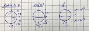
Let’s look at the Coriolis parameter. The Coriolis parameter is defined as f=2 ω sin(φ). ω is the rotation of the Earth, which is  so constant everywhere. φ, however, is the latitude. So φ is 90 at the North Pole, -90 at the South Pole, and 0 at the equator. And this is where the problem arises: The Coriolis parameter depends on the latitude, which means that it changes with latitude! From being highest at the poles (technically: Being highest at the North Pole and the same value but opposite sign at the South Pole) to being zero at the equator. And with the latitude φ obviously changes also sin(φ), and f with both of those.

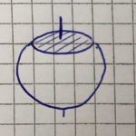
In our tank, however, we don’t have a changing latitude, it’s constant everywhere. You can imagine it a little like sketched below: As if the top of the Earth was cut off at any latitude we chose, and then we just put our tank on the new flat surface on top of the Earth: the latitude is constant everywhere (at least everywhere on the shaded surface where we are putting our tank)!

Since the latitude is constant throughout our tank, so is the Coriolis parameter. That means that if we want to simulate Antarctica, we will match our f to match the real Antarctica’s, except scaled to match our tank. And if we wanted to simulate the Mediterranean*, we would match our f to the one corresponding the Mediterranean’s latitude.

This means that we actually cannot simulate anything in our tank that requires a change in f, much less half the Earth! So currently no equator in our tank (although that would be so much easier: No need to rotate anything since f=0 there! 🙂

*which, in contrast to my sketch above, is well in the Northern Hemisphere and not at the equator, but I am currently sitting at Lisbon Airport and this sketch is the best I can do right now… Hope you appreciate the dedication to blogging 😉

First full week of experiments ended successfully! :-)

As you see, we have increased the rotation rate of the tank! From 1 rotation in 50 seconds to now 1 rotation in 30 seconds. Which means that at the edge of the platform, where we get on and off, the difference in speed between the room and the moving platform is 5,6 km/h. For security reasons we don’t have any movies of people getting on or off: people really need to concentrate on where they are going! And even though Elin recently said that we don’t get sick by the rotation of the platform (link), I can say confidently that that doesn’t hold for all of us any more 😉

But with two days and nights per minute now, it’s not surprising that time flies! Our first full week of experiments is over, and it was quite a success! We’ve been in Grenoble for 1.5 weeks out of our 2 months now, and it’s time for some changes in the team: Elin and I are going to leave for a while (we’ll be back soon!) and Nadine and Lucie will be joined by new team members soon! But of course, we will keep you updated on what is happening here in Grenoble!

For now: Happy weekend, everybody!

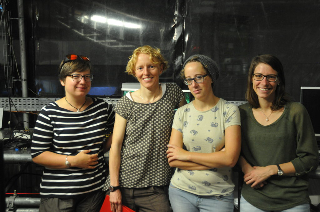
Your team in Grenoble — for the first 1.5 weeks: Mirjam, Elin, Lucie and Nadine (from left to right). Photo: Samuel Viboud

How the strength of the current influences which path it takes. First observations!

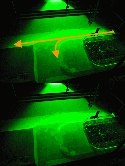
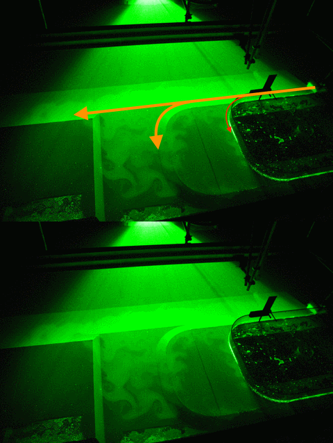
Depending on how strong a current we introduce in the 13-m-diameter rotating tank to simulate the strength of the coastal current in Elin et al.’s 2016 article (link on our blog, link to the article), it takes different pathway along and across our topography.

According to theory, we expected to see something like what I sketched below: The stronger the current, the more water should continue on straight ahead, ignoring the canyon that opens up perpendicular to the current’s path at some point. The weaker the current, the more should take a left into the canyon.

We have now done a couple of experiments, and here you get a sneak preview of our observations!

Small disclaimer beforehand: What you see below are pictures taken with my mobile phone, and the sketched pathways are what I have observed by eye. This is NOT how we actually produce our real data in our experiments: We are using cameras that are mounted in very precisely known positions, that have been calibrated (as described here) and that produce many pictures per second, that are painstakingly analysed with complex mathematics and lots of deep thought to actually understand the flow field. People (hi, Lucie!) are going to do their PhDs on these experiments, and I am really interpreting on the fly while we are running experiments. Also we see snapshots of particle distribution, and we are injecting new particles in the same tank for every experiment and haven’t mixed them up in between, so parts of what you see might also be remnants of previous experiments. So please don’t over-interpret! 🙂

So here we go: For a flow rate of 10 liter per minute (which is the lowest flow rate we are planning on doing) we find that a lot of the water is going straight ahead, while another part of the current is following the shelf break into the canyon.

For 20 liter per minute, our second lowest flow rate, we find that parts of the current is going straight ahead, parts of it is turning into the canyon, and a small part is following along the coastline (Which we didn’t expect to happen). However it is very difficult to observe what happens when the flow is in a steady state, especially when velocities are low, since what jumps at you is the particle distribution that is not directly related to the strength of the current which we are ultimately interested in… So this might well be an effect of just having switched on the source and the system still trying to find its steady state.

The more experiments we run in a day after only stirring the particles up in the morning, the more difficult it gets to observe “by eye” what is actually happening with the flow. But that’s what will be analysed in the months and years to come, so maybe it’s good that I can’t give away too many exciting results here just yet? 😉


How our experiments relate to the real Antarctica

After seeing so many nice pictures of our topography and the glowing bright green current field around it in the tank, let’s go back to the basics today and talk about how this relates to reality outside of our rotating tank.

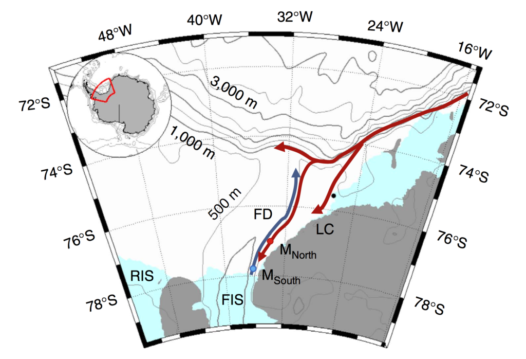
Below, you see the area that we are trying to reproduce in the tank: A small part of the Wedell Sea, where we have idealized topography representing the Luipold coast and the Ronne Ice Shelf and represent the Filchner Depression by our canyon. Can you recognize it from yesterday’s post?

Figure 1 or Darelius, Fer & Nicholls (2016): Map. Location map shows the moorings (coloured dots), Halley station (black, 75°350 S, 26°340 W), bathymetry and the circulation in the area: the blue arrow indicates the flow of cold ISW towards the Filchner sill and the red arrows the path of the coastal/slope front current. The indicated place names are: Filchner Depression (FD), Filchner Ice Shelf (FIS), Luipold coast (LC) and Ronne Ice Shelf (RIS).

Above you see the red arrows indicating the coastal/slope front currents. Where the current begins in the top right, we have placed our “source” in our experiments. And the three arms the current splits into are the three arms we also see in our experiments: One turning after reaching the first corner and crossing the shelf, one turning at the second corner and entering the canyon, and a third continuing straight ahead. And we are trying to investigate which pathway is taken depending on a couple of different parameters.

The reason why we are interested in this specific setup is that the warm water, if it turns around the corner and flows into the canyon, is reaching the Filchner Ice Shelf. The more warm water reaches the ice shelf, the faster it will melt, contributing to sea level rise, which will in turn increase melt rates.

In her recent article (Darelius, Fer & Nicholls, 2016), Elin discusses observations from that area that show that pulses of warm water have indeed reached far as far south as the ice front into the Filchner Depression (our canyon). In the observations, the strength of that current is directly linked to the strength of the wind-driven coastal current (the strength of our source). So future changes in wind forcing (for example because a decreased sea ice cover means that there are larger areas where momentum can be transferred into the surface ocean) can have a large effect on melt rates of the Filchner Ice Shelf, which might introduce a lot of fresh water in an area where Antarctic Bottom Waters are formed, influencing the properties of the water masses formed in the area and hence potentially large-scale ocean circulation and climate.

The challenge is that there are only very few actual observations of the area. Especially during winter, it’s hard to go there with research ships. Satellite observations of the sea surface require the sea surface to be visible — so ice and cloud free, which is also not happening a lot in the area. Moorings give great time series, but only of a single point in the ocean. So there is still a lot of uncertainty connected to what is actually going on in the ocean. And since there are so few observations, even though numerical models can produce a very detailed image of the area, it is very difficult how well their estimates actually are. So this is where our tank experiments come in: Even though they are idealised (the shape of the topography looks nothing like “real” Antarctica etc.), we can measure precisely how currents behave under those circumstances, and that we can use to discuss observations and model results against.

Darelius, E., Fer, I., & Nicholls, K. W. (2016). Observed vulnerability of Filchner-Ronne Ice Shelf to wind-driven inflow of warm deep water. Nature communications, 7, 12300.

Water jet pumps, and why we don’t like them in our experiments

Just a quick update from the lab tonight: We are fixing more bugs by the hour 🙂

First: the bubble-free source.

I have previously written about how we thought we were going to get our source bubble-free (link here). Turns out, it’s not quite as easy as we thought — there were still plenty of bubbles everywhere! But luckily, Thomas came to our rescue and put some foam inside the source so the water has to pass through there before leaving the source through the honeycomb.  That effectively gets rid of all the bubbles since they just don’t fit through and surface inside the source box instead of outside of it in our experiment. We were really concerned about all those bubbles for two reasons: A) They might show up in the pictures we want to analyse and destroy any correlations we are hoping to find since they are there one second and then burst and disappear the next. And B) since the bubbles left the source below water level, they popped up to the surface and introduced vertical flow where we really didn’t want it.

But anyway, the bubbles are gone now! It’s amazing how well that works and all our (ok, my) prophecies of doom (the water is never to go through the foam! It is going over it and then enter the tank as a water fall! And even if it does go through, the particles we need to visualize the flow with, won’t!) were completely unnecessary.

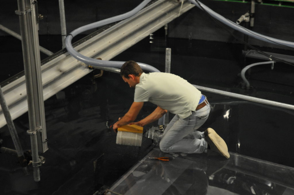
Thomas kneeling on Antarctica, fixing our source

Second: The unwanted water jet pump.

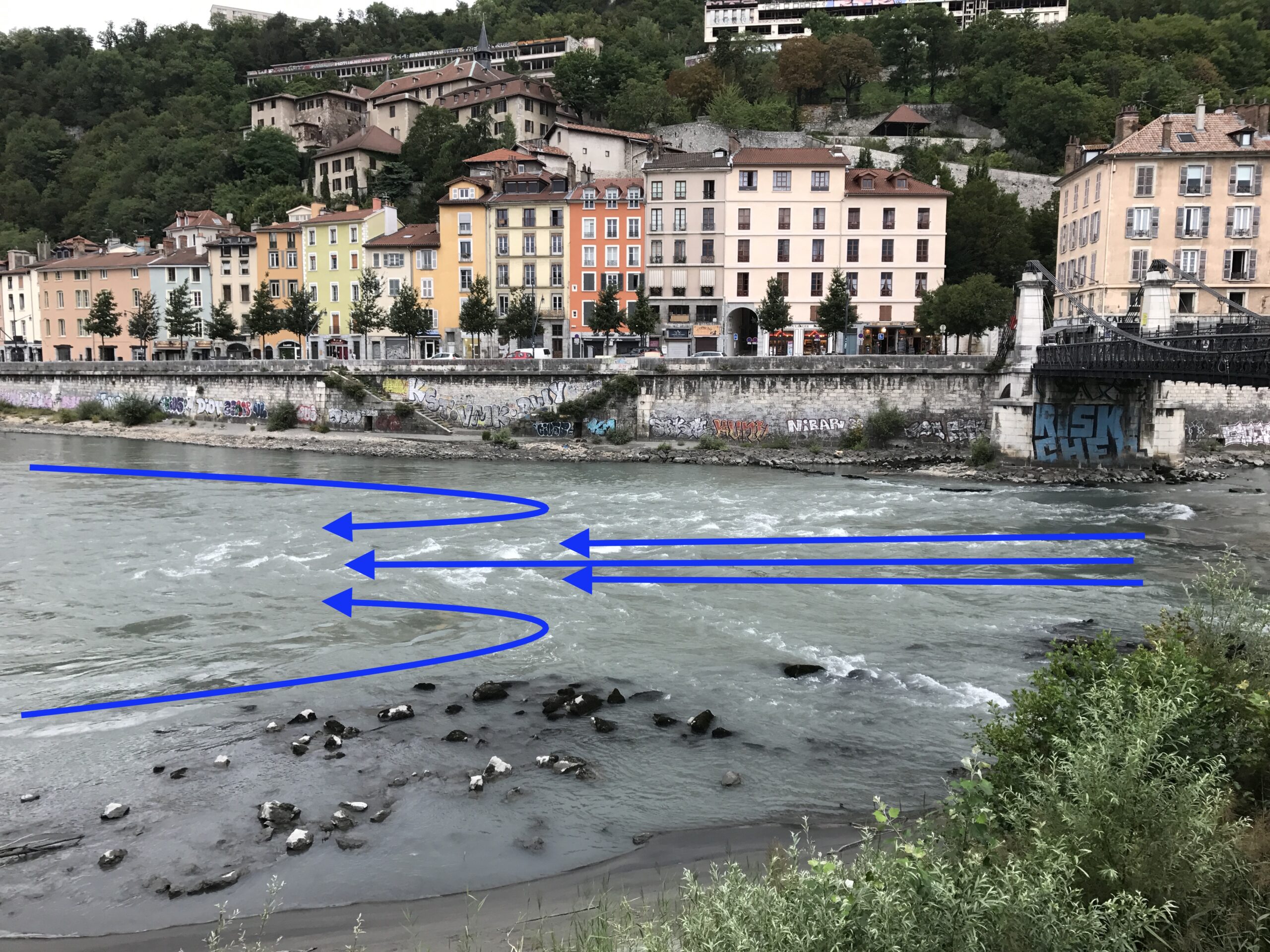
We don’t actually know where it happened, but somewhere there was a leak and air got pulled into our inflow. Thomas and Samuel fixed this problem, too, but this is what happened: We have quite a fast flow from a reservoir sitting high above the tank down to the source. The faster the flow, the lower the pressure in it, which means that it sucks stuff (in our case air) from the surroundings, and entrains it. And that’s exactly the effect that is used in water jet pumps, except there people want it to happen…

Below you see an example of the Isère here in Grenoble, where a rather fast flow is causing a return flow as soon as the river bed widens a little.

Anyway, now it’s almost dinner time in our shared flat. But we’ll be back tomorrow with first results from our experiments! 🙂

What are we actually trying to measure in our rotating swimming pool?

You’ve heard us talk a lot about rotating swimming pools. Nadine has written about why we care about Antarctic ice shelf melting (link), why the ice shelf is melting (link) and how we are going to investigate it (link). Today, I am going to bring those explanations together with all that you’ve seen so far about our experiments in Grenoble. I hope! 🙂

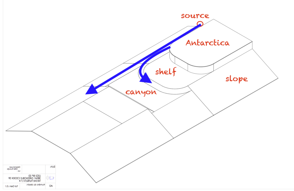
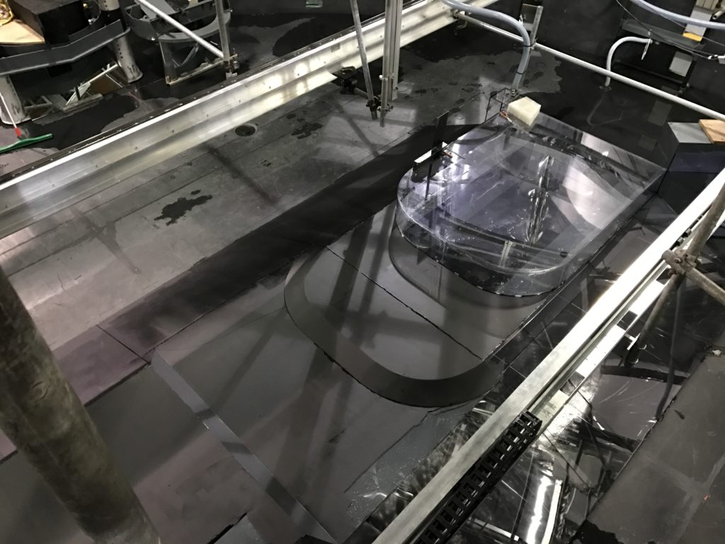
Let’s start with a technical drawing of our “Antarctica”, the topography we have in the middle of the tank. You have seen it in many of our previous posts: It’s the thing that used to be in clear plastic, but that one early morning got painted black.

Drawing modified after Samuel Viboud with permission

What we are investigating is how a current, introduced at the “source”, will behave. We expect that it will flow along the shelf break and that some of it will turn left and flow around the corner into the canyon, while some of it will continue on straight ahead. How large a portion of the current takes which part depends on several parameters, which we will systematically change over the next couple of weeks: How large the source’s flow rate is (we are starting with 50 liter per minute), whether there is a density difference between the source water and the ambient water (we are starting with no density difference but will later have salt water in the tank and a fresher source) and what happens if we add a sharp corner to the nice and smooth corner of Antarctica and the shelf.

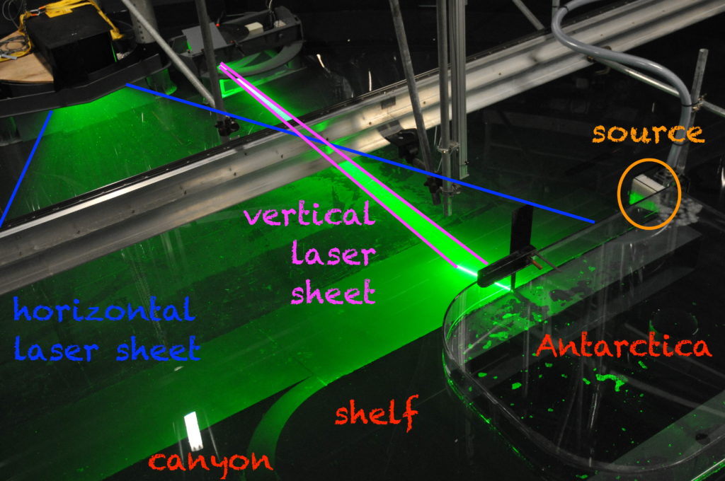
So far, so good. When we look down from the rotating first-floor office, things look a little different (an annotated version further down this page):

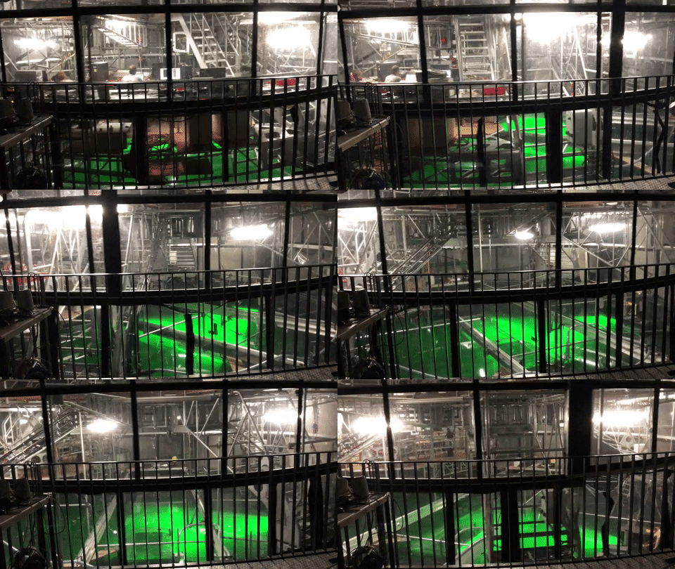
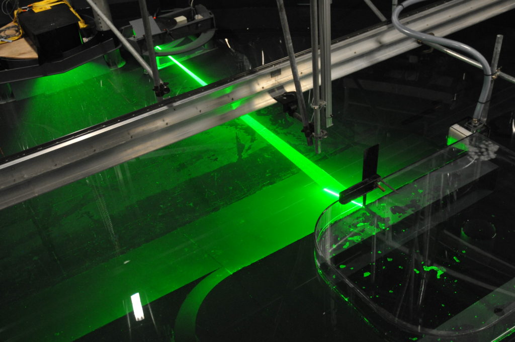
You see (parts of) the topography in the lower right corner of the image. And then you see a lot of green light: Our laser sheets! The laser sheets will illuminate thin layers of water, which we can take pictures of with cameras mounted perpendicularly to the sheets. That in itself isn’t so exciting, but we will have neutrally buoyant particles in the water, which light up when lit with the laser. If we take enough pictures of the particles, we can track individual particles as they get advected by the currents, and thus get a good idea of the flow field that is illuminated by the lasers.

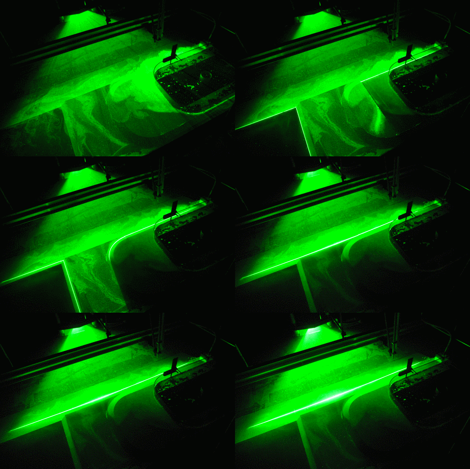
And the cool thing is that we have not only one, but six vertical laser sheets, that are used sequentially. Below you see our first experiment and each picture in the animated gif is showing you a different layer, going from 5 cm below the surface down, so you get an idea of the vertical shape of the flow field. And you see that there is a lot more going on in the layers close to the surface!

Isn’t this amazing? How lucky are we that we got the opportunity to travel to Grenoble to be involved in all of this? 🙂

Introducing: Lucie Vignes

Written by Lucie Vignes:

I am Lucie, I will spend 3 weeks in Grenoble to work on the
topographic aspect of the experiment. I am starting a PhD in October
in LOCEAN (Paris) to work about water masses circulation and
transformation in the Weddell Sea, which is surrounding Antarctica.
Regarding my thesis subject, the experiments that are going to take
place in Grenoble will (I hope) help to have a better understanding of
the dynamical processes in the Weddell Sea.
I have a master in physical oceanography,  in which I studied oceanic
circulation, geophysical fluid dynamics and coastal dynamics.
I am super happy to work on the Coriolis platform and hope that we
will see nice phenomenon.

Getting rid of bubbles in our jet

Sometimes the devil is in the details…

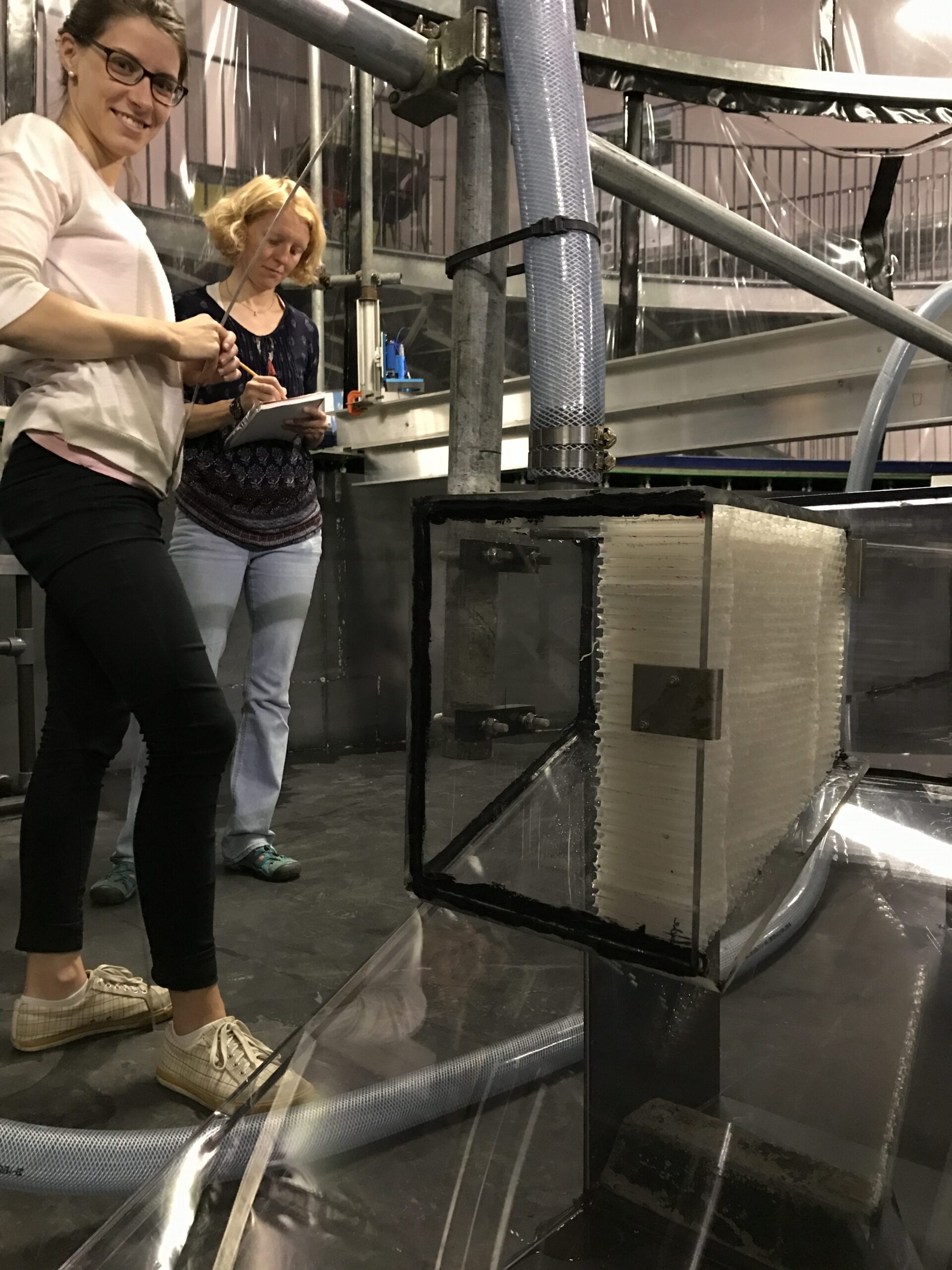
On our first day at the Coriolis platform in Grenoble, I took a picture of the “source” in our experiments (see above): The plastic box that is fed by a hose from above and that has one open side with a “honeycomb” (or: a make-the-outflowing-water-nice-and-laminar thingy, technical term) that introduces the water into the tank that we want to follow around Antarctica.

This source is sitting against our topography, and will be partly submerged so that we introduce the jet at water level and below (instead of having a waterfall going in). The idea is to get a nice and bubble-free flow because — as we talked about yesterday — bubbles reflect the laser very strongly and disguise the signal that we are actually interested in.

So when we were doing our first tests last night, the first step was to flush out all the bubbles from all the pipes and hoses that supply the water to our source. Except that bubbles kept coming. And coming. Until, at some point, we realised that this was the problem:

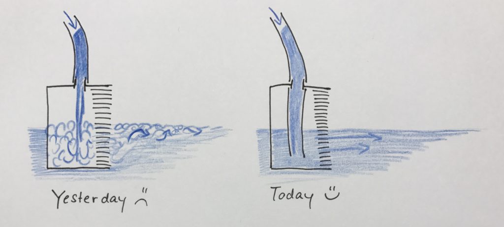
The inflowing water was free-falling through air before hitting the water inside the source box, thus entraining a lot of air bubbles directly inside of the source. Good luck flushing them out… The solution was to add an extra piece of hose to just below the water surface so no air can be entrained.

So when we arrived at the lab this morning to an empty tank* we were delighted to see that the amazing Samuel and Thomas had already fixed the source!

*Yes, the tank really was empty again. Turns out that the reflection of the laser off the topography is so strong that it’s both a problem for data quality and that too much of the light gets scattered out of the water to be safe when we use the laser at it’s real setting for the experiments rather than at the super low setting we used for the tests… Disappointing, yes, but we were so surprised and pleased when we arrived this morning and the topography had already been painted AND the source  been fixed! We are super impressed with and grateful to the awesome team here in Grenoble! 🙂 And we are happy to report that there is water in the tank again and we can start measuring after lunch!