When watching the images or movies that show the rotating tank from the outside, you may have been wondering about why the whole structure — tank, office above the tank, everything — is inside a rotating tent, which itself is inside a large room.
Remember the last time you were on a merry-go-round? Remember the wind on your face and in your hair? Yes, that’s exactly what we don’t want. Neither for us sitting in the office, nor, more importantly, for our tank.
If there wasn’t a tent around the whole structure, rotating with it, we would always have “wind” on the tank’s free water surface, because the water would be in motion relative to the room in which the tank is located. The friction between air and water would then cause wind-driven surface currents, which might disturb our experiments. Now, however, the air inside the tent is rotating with the tank, hence there is no motion of the air relative to the water, no wind, no wind-driven currents, perfect conditions for our experiments!
And believe me, when you step out of the tent on your way off the rotating platform, or from the stationary room onto the platform on your way in, you definitely feel the wind!
Yesterday, the rotating tank was empty again and we used the whole day for an intensive session of data analyzing. Why was the tank empty again? We realized that the source was too close to the first corner when we used high inflow rates, so that the flow was not completely established once we reached the first corner. Therefore, we decided to move the position of the source 2m back to have a more established flow once it reaches the first corner. Samuel and Thomas did a great job with building a new slope and moving the source. However, it took quite some time to dry the glue, so that we had an empty tank yesterday and used this opportunity to process the data.
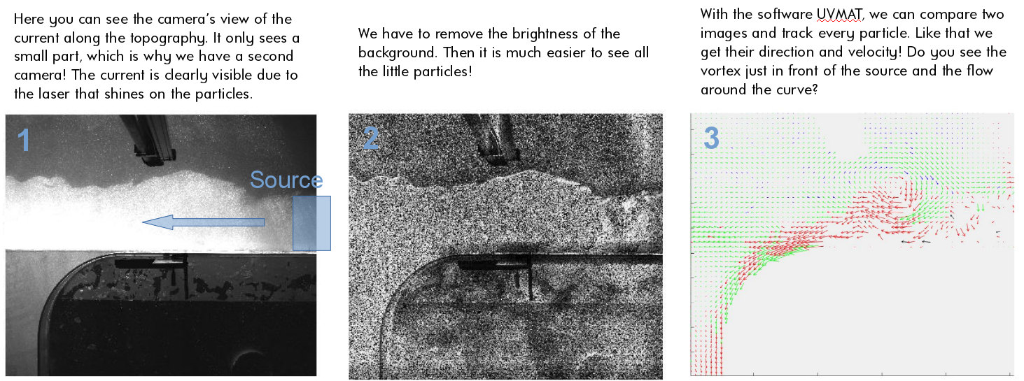
For the data processing, the people from the Coriolis platform provided us with the software UVMAT, which can conduct all the steps from the image to a velocity field. In a simplified way, the three images below show these different steps from one experiment that we did last friday.
A very common idea of what goes on in our tank is that we have a tiny Antarctica in the center and that the edge of our tank then represents the equator. We are rotating in Southern Hemisphere direction, clockwise when looked from above the pole. And when looking at the Earth that way, where the Earth seems to end is at the equator. It makes sense to intuitively assume that the edge of the tank then also represents “the end of the world”, i.e. the equator.
But then it is confusing that our Antarctica is so big relative to a whole hemisphere and that we don’t have any other continents in our tank. And it’s confusing because the idea that the edge of our tank represents the equator is actually wrong.
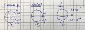
Let’s look at the Coriolis parameter. The Coriolis parameter is defined as f=2 ω sin(φ). ω is the rotation of the Earth, which is so constant everywhere. φ, however, is the latitude. So φ is 90 at the North Pole, -90 at the South Pole, and 0 at the equator. And this is where the problem arises: The Coriolis parameter depends on the latitude, which means that it changes with latitude! From being highest at the poles (technically: Being highest at the North Pole and the same value but opposite sign at the South Pole) to being zero at the equator. And with the latitude φ obviously changes also sin(φ), and f with both of those.
In our tank, however, we don’t have a changing latitude, it’s constant everywhere. You can imagine it a little like sketched below: As if the top of the Earth was cut off at any latitude we chose, and then we just put our tank on the new flat surface on top of the Earth: the latitude is constant everywhere (at least everywhere on the shaded surface where we are putting our tank)!
Since the latitude is constant throughout our tank, so is the Coriolis parameter. That means that if we want to simulate Antarctica, we will match our f to match the real Antarctica’s, except scaled to match our tank. And if we wanted to simulate the Mediterranean*, we would match our f to the one corresponding the Mediterranean’s latitude.
This means that we actually cannot simulate anything in our tank that requires a change in f, much less half the Earth! So currently no equator in our tank (although that would be so much easier: No need to rotate anything since f=0 there! 🙂
—
*which, in contrast to my sketch above, is well in the Northern Hemisphere and not at the equator, but I am currently sitting at Lisbon Airport and this sketch is the best I can do right now… Hope you appreciate the dedication to blogging 😉
After seeing so many nice pictures of our topography and the glowing bright green current field around it in the tank, let’s go back to the basics today and talk about how this relates to reality outside of our rotating tank.
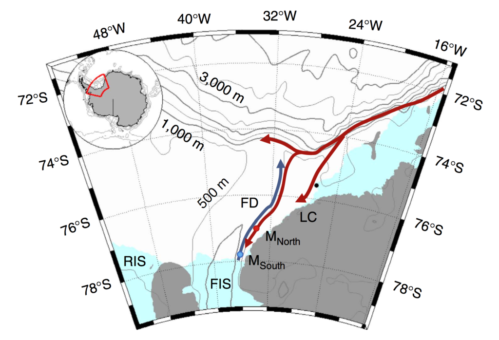
Below, you see the area that we are trying to reproduce in the tank: A small part of the Wedell Sea, where we have idealized topography representing the Luipold coast and the Ronne Ice Shelf and represent the Filchner Depression by our canyon. Can you recognize it from yesterday’s post?
Figure 1 or Darelius, Fer & Nicholls (2016): Map. Location map shows the moorings (coloured dots), Halley station (black, 75°350 S, 26°340 W), bathymetry and the circulation in the area: the blue arrow indicates the flow of cold ISW towards the Filchner sill and the red arrows the path of the coastal/slope front current. The indicated place names are: Filchner Depression (FD), Filchner Ice Shelf (FIS), Luipold coast (LC) and Ronne Ice Shelf (RIS).
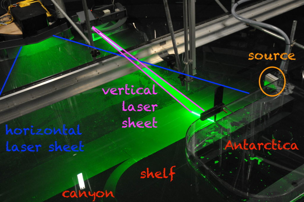
Above you see the red arrows indicating the coastal/slope front currents. Where the current begins in the top right, we have placed our “source” in our experiments. And the three arms the current splits into are the three arms we also see in our experiments: One turning after reaching the first corner and crossing the shelf, one turning at the second corner and entering the canyon, and a third continuing straight ahead. And we are trying to investigate which pathway is taken depending on a couple of different parameters.
The reason why we are interested in this specific setup is that the warm water, if it turns around the corner and flows into the canyon, is reaching the Filchner Ice Shelf. The more warm water reaches the ice shelf, the faster it will melt, contributing to sea level rise, which will in turn increase melt rates.
In her recent article (Darelius, Fer & Nicholls, 2016), Elin discusses observations from that area that show that pulses of warm water have indeed reached far as far south as the ice front into the Filchner Depression (our canyon). In the observations, the strength of that current is directly linked to the strength of the wind-driven coastal current (the strength of our source). So future changes in wind forcing (for example because a decreased sea ice cover means that there are larger areas where momentum can be transferred into the surface ocean) can have a large effect on melt rates of the Filchner Ice Shelf, which might introduce a lot of fresh water in an area where Antarctic Bottom Waters are formed, influencing the properties of the water masses formed in the area and hence potentially large-scale ocean circulation and climate.
The challenge is that there are only very few actual observations of the area. Especially during winter, it’s hard to go there with research ships. Satellite observations of the sea surface require the sea surface to be visible — so ice and cloud free, which is also not happening a lot in the area. Moorings give great time series, but only of a single point in the ocean. So there is still a lot of uncertainty connected to what is actually going on in the ocean. And since there are so few observations, even though numerical models can produce a very detailed image of the area, it is very difficult how well their estimates actually are. So this is where our tank experiments come in: Even though they are idealised (the shape of the topography looks nothing like “real” Antarctica etc.), we can measure precisely how currents behave under those circumstances, and that we can use to discuss observations and model results against.
You’ve heard us talk a lot about rotating swimming pools. Nadine has written about why we care about Antarctic ice shelf melting (link), why the ice shelf is melting (link) and how we are going to investigate it (link). Today, I am going to bring those explanations together with all that you’ve seen so far about our experiments in Grenoble. I hope! 🙂
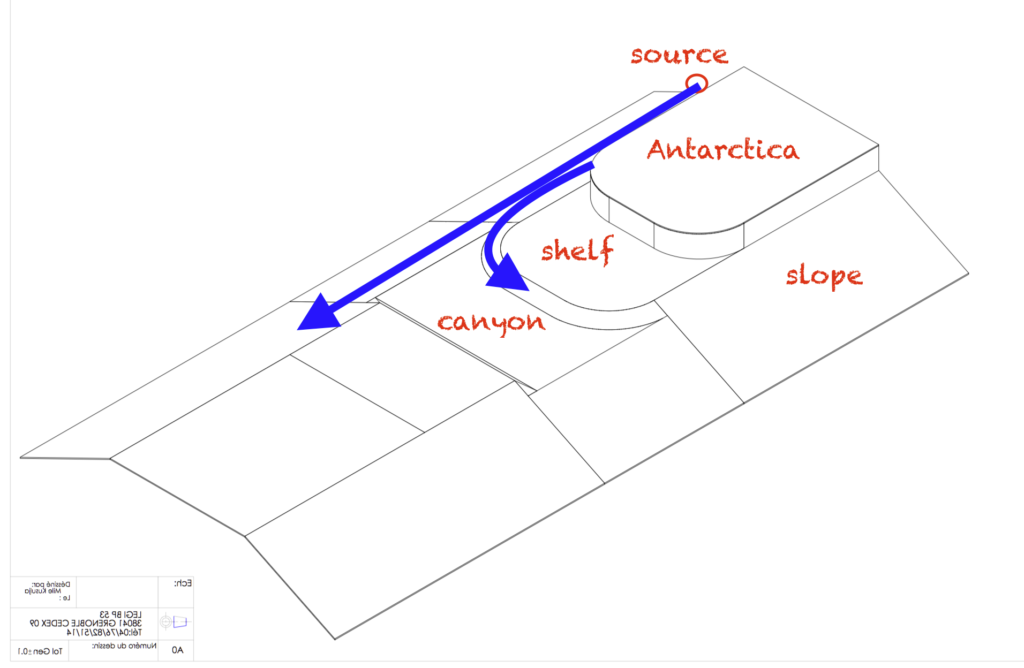
Let’s start with a technical drawing of our “Antarctica”, the topography we have in the middle of the tank. You have seen it in many of our previous posts: It’s the thing that used to be in clear plastic, but that one early morning got painted black.
Drawing modified after Samuel Viboud with permission
What we are investigating is how a current, introduced at the “source”, will behave. We expect that it will flow along the shelf break and that some of it will turn left and flow around the corner into the canyon, while some of it will continue on straight ahead. How large a portion of the current takes which part depends on several parameters, which we will systematically change over the next couple of weeks: How large the source’s flow rate is (we are starting with 50 liter per minute), whether there is a density difference between the source water and the ambient water (we are starting with no density difference but will later have salt water in the tank and a fresher source) and what happens if we add a sharp corner to the nice and smooth corner of Antarctica and the shelf.
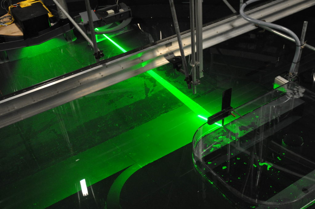
So far, so good. When we look down from the rotating first-floor office, things look a little different (an annotated version further down this page):
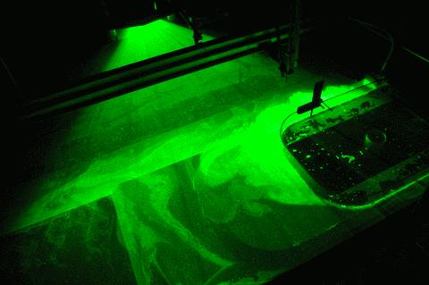
You see (parts of) the topography in the lower right corner of the image. And then you see a lot of green light: Our laser sheets! The laser sheets will illuminate thin layers of water, which we can take pictures of with cameras mounted perpendicularly to the sheets. That in itself isn’t so exciting, but we will have neutrally buoyant particles in the water, which light up when lit with the laser. If we take enough pictures of the particles, we can track individual particles as they get advected by the currents, and thus get a good idea of the flow field that is illuminated by the lasers.
And the cool thing is that we have not only one, but six vertical laser sheets, that are used sequentially. Below you see our first experiment and each picture in the animated gif is showing you a different layer, going from 5 cm below the surface down, so you get an idea of the vertical shape of the flow field. And you see that there is a lot more going on in the layers close to the surface!
Isn’t this amazing? How lucky are we that we got the opportunity to travel to Grenoble to be involved in all of this? 🙂
We have started rotating and filling water into our 13-meter-diameter rotating tank! So exciting! Pictures of that to come very soon.
But first things first: Why do we go to the trouble of rotating the swimming pool?
The Earth’s rotation is the reason why movement that should just go straight forward (as we learned in physics class) sometimes seems to be deflected to the side. For example, trade winds should be going directly towards the equator from both north and south, since they are driven by hot air rising at the equator, which they are replacing. Yet we see that they blow towards the west in addition to equatorward. And that is because the Earth is rotating: So even though the air itself is only moving towards the equator, when observed from the Earth, the winds seem to be deflected by what is called the Coriolis force.
The influence of the Coriolis force becomes visible when you look at weather systems, which also swirl, rather than air flowing straight to the center where it then raises. Or when you look at tidal waves that propagate along a coastline rather than just spreading out in all directions. Or when you look at ocean currents. But all of these effects are fairly large-scale and not so easy to observe directly by just looking up in the sky or out on the ocean for a short while.
There are however easy ways to experience the Coriolis force when you play on a merry-go-round or with a record player or with anything rotating, really. Those are obviously spinning much faster than the Earth, and that’s exactly the point: The faster rotation makes it easy for us to see that something is going on. And obviously, Nadine and I had to test just that on the best merry-go-round that I have ever seen:
And that is what we’ll use in our experiments, too: Since our topography is a lot smaller than the real world it is representing, we also have to turn the tank faster than the real world is turning in order to get comparable flow fields. How to exactly calculate how fast we need to turn we’ll talk about soon. Stay tuned! 🙂
The shelf break and the ice shelf front—Two topographic barriers
So far, we’ve explained you that outside the Antarctic continent, warm and saline water (Circumpolar Deep Water, CWD) is located beneath fresh and cold water (Surface Water). We’ve also explained you that if this warm and saline water gets onto the continental shelf and mixes with high salinity shelf water, it melts the ice shelf from below. You think that sound easy? Well, it’s not! The ice shelves are actually pretty well protected from this warm subsurface water…
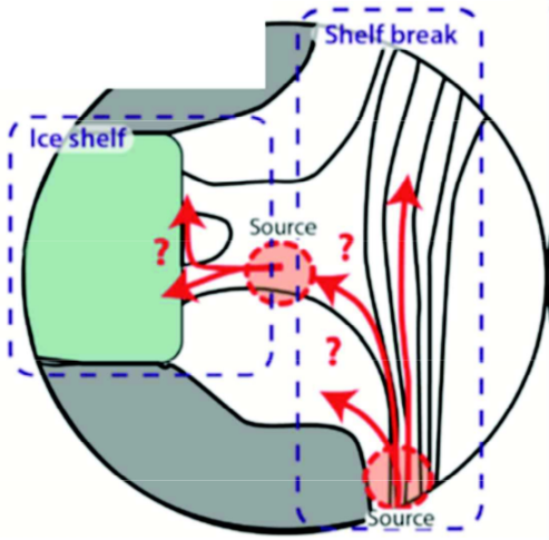
In Figure 5 from our post on Tuesday you can see that especially the largest ice shelves—Filchner-Ronne and Ross Ice Shelves—are protected from warm water through the continental shelves that keep the warm water at a distance of several hundreds of kilometers. Oceanic currents tend to flow along the bathymetry (slopes), not across it. The continental slope—the steep slope connecting the deep Southern Ocean to the continental shelf— thus acts like a wall and limits the flow of warm water onto the shelf. In the Amundsen and Bellinghausen Sea, however, the warm water already reaches on the continental shelf, and it reaches all the way to the ice shelf front. The ice shelf front reaches many hundreds of meter down into the water, and it forms a second wall that the water has to cross in order to reach the cavities beneath the ice shelves. The pathway of the warm water across these two walls, or topographic barriers as we like to call them, is still poorly understood and therefore the main focus of our project. How does the warm water that is located outside the continental shelf and in a depth of hundreds of meters flow onto the continental shelf and beneath the ice shelf?
Figure 7. Sketch for the project TOBACO of the uncertainties in the warm water flow across the shelf break and the ice shelf front.
Topographic steering
The rotation of the Earth causes ocean currents flow parallel to topographic slopes, i.e. to roughly follow lines of constant depth. The currents around Antarctica therefore follow the continental slope, and water from the slope doesn’t easily make it onto the continental shelf. Similarly, at an ice shelf front currents mainly flow parallel to the front instead of entering the ice shelf cavity. The shelf break and the ice shelf front form a topographic barrier
Warm water has been measured on the continental shelf and beneath ice shelves. In fact, the water can cross topographic barriers after all!
Certain processes help the warm Circumpolar Deep Water to cross the barriers:
Troughs crosscutting the continental shelf and the shelf break reduce the barrier effect and enable on-shelf transport.
Eddies formed within the currents are able to move across the “barriers” bringing (warm) water with them.
During our time at the Coriolis platform, we will investigate these points by varying the trough geometries, current thickness and density. If you are interested, please follow our blog throughout the experiments and learn about the control of topography on ocean currents and ice shelf melt!
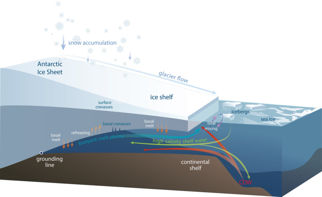
The Antarctic Ice Sheet is melting because it is losing more mass through increased air and ocean temperatures than it gains mass by snow fall. Melting of ice is most efficient through contact with water, because water has a higher heat conductivity compared to air; simply said this means that water removes heat easier from the ice than air. In case of the Antarctic Ice Sheet it is also of importance that air temperatures are mainly far below the freezing point, whereas the ocean is always warmer than or close to the freezing point. The strongest melting in Antarctica therefore occurs beneath ice shelves. You want to know more about the melting process and what happens beneath an ice shelf?
The ice pump beneath ice shelves
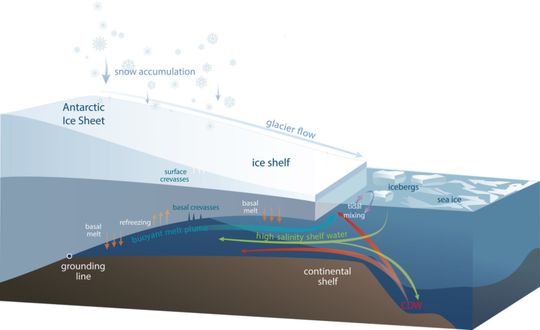
Ice shelves are melting from beneath as ocean water reaches into the cavity. To explain the processes, we come back to the sketch of an ice shelf that we already showed you before.
In front of ice shelves the ocean freezes to sea ice, which is a process that produces very saline and dense water (high salinity shelf water). Because of its high density, it sinks down and mixes with circumpolar deep water (CDW) that spills over the continental shelf edge. The water mixture is then relatively dense and warm. It flows along the bottom of the continental shelf that is—in many cases—deepening inland and therefore reaches far beneath the ice shelf. When the water reaches to the ice shelf base it is far below sea level and at a higher pressure. Water there can still be liquid at temperatures down to below -2⁰C! And the ice starts melting as soon as the temperatures reach above this pressure melting point! If the ocean water is warmer than this temperature, it melts the ice shelf from below. The melt water is fresh with a low density and brings water out of the ice shelf cavity in form of a buoyant melt plume. All together, this forms an ocean circulation beneath the ice shelf, called ice pump.
Figure 4. This sketch shows a typical Antarctic ice shelf that starts floating from the grounding line and enables the flow of warm circumpolar deep water (CDW) underneath the ice shelf. The ice therefore melts from below (basal melt) and this melt water rises as a buoyant melt plume. Image credit: Helen Amanda Fricker, Professor, Scripps Institution of Oceanography, UC San Diego.
Where does the warm water come from?
The rates at which all Antarctic ice shelves melt from beneath are estimated to be about 1325 Gt/yr (gigatons per year; or 3.7 mm sea level equivalent per year). Yes, this is a lot! We are wondering where all the energy comes from and how the warm water reaches onto the continental shelf…
The dynamics governing the flow of warm water towards and underneath the ice shelves are non-trivial and still poorly understood. However, we know that the heat reservoir threatening the ice shelves is located off the continental shelf, in the deep Southern Ocean, where relatively warm water resides below a shallow, cold and fresh surface layer. Well, you may wonder how cold water can float on top of warm water!? If you have ever been swimming in a lake or in the ocean, you may have realized that it usually gets colder the further down you get.
Water layers in the oceans are stratified due to their different densities, with the densest water masses lying at the bottom of the sea floor and the lightest water masses floating at the surface. Density is given by the salt content and the temperature: high salinity and low temperatures lead to the densest water masses. In the tropics, the temperature is more important and it usually gets colder with depth. Closer to the poles, however, salinity gets more important. In the Southern Ocean, the warmer water can stay beneath the cold and fresh surface layer, because of its high salt concentration. The warm subsurface water it transported with the Antarctic slope current, which flows westwards along the Antarctic slope almost around the whole Antarctic continent.
West Antarctic threatened by a warm ocean
In West Antarctic, especially in the Amundsen and the Bellinghausen Sea, the water found on the continental shelf is relatively warm compared to East Antarctic (Figure 5), resulting in high melt at the base of the ice shelves. Some of the ice shelves therefore thin tens of meters per decade! This thinning also expands upstream to the proximal grounded glaciers which then causes a sea level rise. The figure shows that already today one drainage area in West Antarctica alone lost almost 100 Gt/yr to the ocean, with a trend towards increasing numbers due to basal malt. These basal melt rates are challenging to estimate, which makes the contribution of West Antarctic Ice Sheet melt to sea level rise to the largest source of uncertainty in the fifth assessment report of the Intergovernmental Panel on Climate Change (IPCC).
Figure 5. Water temperatures of the Southern Ocean around the Antarctic Ice Shelf and the resulting ice shelf thickness change per year, as well as the ice loss from the grounded ice sheet that actually contributed to sea level rise (circles) (Pritchard et al., 2012).
West Antarctic – A marine ice sheet
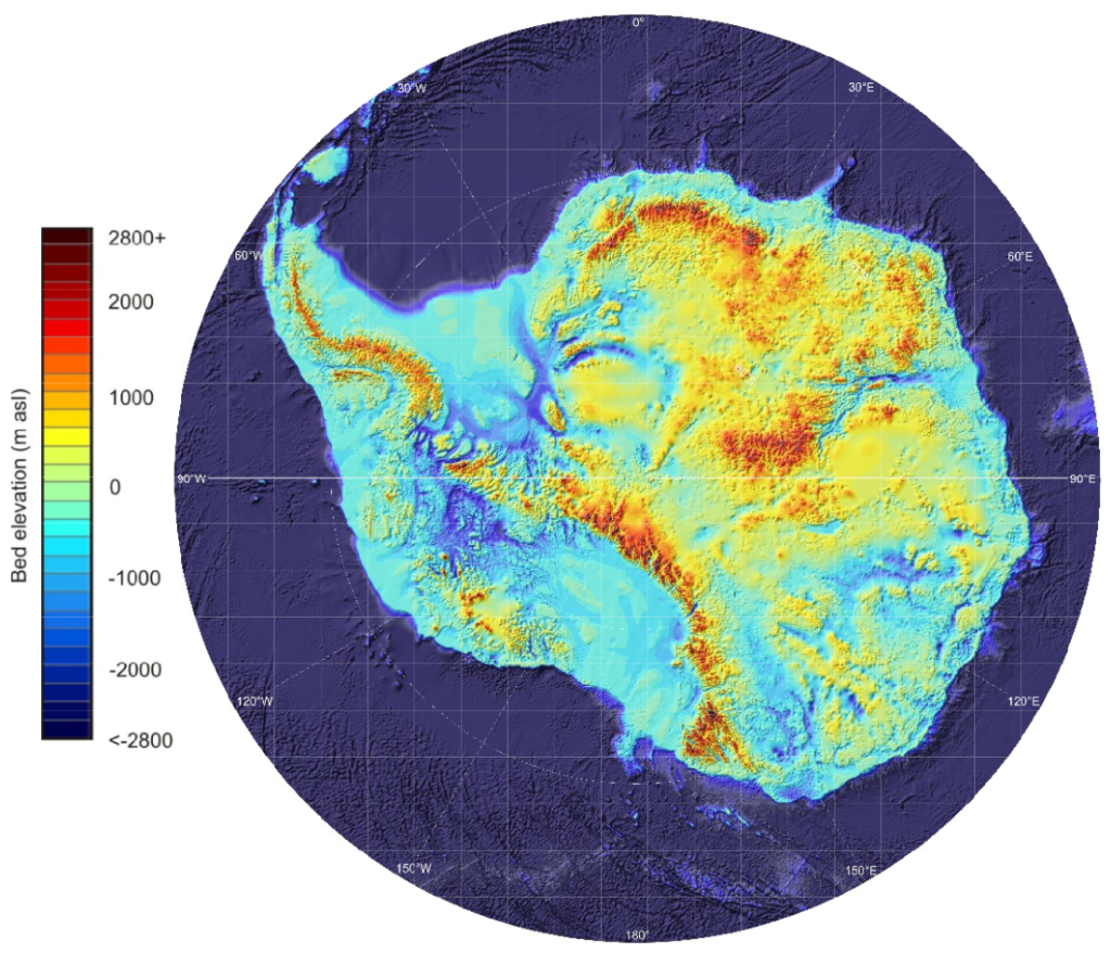
Besides the ocean temperatures, there is another substantial difference between West and East Antarctica that leads to the high mass loss in the former one: The bedrock beneath the West Antarctic Ice Sheet lies far below sea level (up to more than 1 km) in most parts (the blue areas in Figure 6). Thus, most of the ice sheet’s base is located far below sea level, what we call a marine ice sheet. Marine ice sheets are particularly instable for several reasons:
Their bed slopes inland, which generally is an instable configuration. As submarine melt moves the grounding line—the transition zone between grounded and floating ice—further inland, it reaches into deeper areas, that make the glacier floating again and also causes a larger flux through the grounding line. Once this process is triggered, the glacier retreats continuously until the bed geometry changes again.
The pressure melting point—the temperature at which ice freezes or melts—is reduced when the pressure increases. When the glacier base reaches into deeper waters where the pressure is higher, the melting point therefore decreases and the surrounding water is warm relative to the melting point. It may be warm enough to melt the ice from below.
The uncertainty regarding the West Antarctic Ice Sheet melt to sea level rise therefore results from the exposure of the ice sheet to relatively warm water. The ice sheet is also close to a tipping point at which the ice sheet may irreversibly lose large amounts of ice. To better estimate future sea level rise, we need a good estimate on the ocean heat flux to the ice shelves and good knowledge on the response of the ice sheet.
Figure 6. The bed topography beneath the Antarctic Ice Sheets reveals that most parts of West Antarctica lie beneath sea level, which makes the West Antarctic Ice Sheet sensitive to ocean warming (Fretwell et al., 2013)
Are you exited about our experiments at the Coriolis platform? We can’t await to finally getting started with the experiments! To shorten the waiting time, we would like to introduce you into the topic of our research throughout the next three days, so that it will be easier for your to follow up on the happening in Grenoble. Today, we will introduce to the Antarctic Ice Sheet and its fringing ice shelves…
The Antarctic Ice Sheet and sea level rise
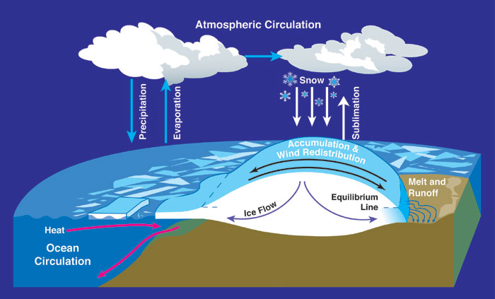
The Antarctic Ice Sheet contains 26.5 Mio km³ of ice. Such a big number is difficult to grasp, but it is 70% of the Earth’s freshwater and equals—if the ice is completely melted—a sea level rise by 58 m. Luckily melting of an ice sheet is a slow process which is compensated by the accumulation of snow as shown in the sketch below. However, this compensation got out of balance during the last two decades and we know from satellite observations that the Antarctic Ice Sheet is losing more mass to the ocean than it gains by snow fall. In average, it lost about 310 +- 74 km³ (or 0,78 mm of sea level rise) per year during 2003-2012; especially in West Antarctic this mass loss has accelerated so that the area has already lost 70 % more ice compared to a decade ago (Paolo 2015).
Figure 1. Here is a sketch of the Antarctic Ice Sheet and its interaction with the atmosphere and the ocean. Ice forms through the accumulation of snow and slowly flows to the sides due to its own weight. When it reaches lower elevations, it melts by warm air temperatures or by the ocean where it ends in ice shelves—the floating extension of an ice sheet—as seen on the left side of the figure. Source: NASA. From Wikipedia Commons.
Ice shelves are important!
Most of Antarctica’s periphery (75%) is buttressed by ice shelves—the floating extension of an ice sheet. Ice shelves occur, where the ice is thin and the bed rock far enough below sea level that the ice gets lifted off the underlying bedrock. As soon as the ice is detached from the bed, ocean water can penetrate beneath it and start melting as shown in the sketch below.
Figure 2. This sketch shows a typical Antarctic ice shelf that starts floating from the grounding line and enables the flow of warm circumpolar deep water (CDW) underneath the ice shelf. The ice therefore melts from below (basal melt) and this melt water rises as a buoyant melt plume. Image credit: Helen Amanda Fricker, Professor, Scripps Institution of Oceanography, UC San Diego.
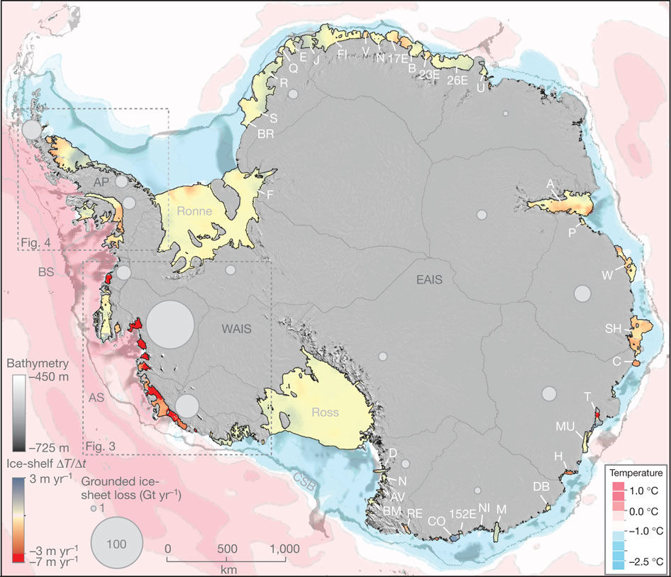
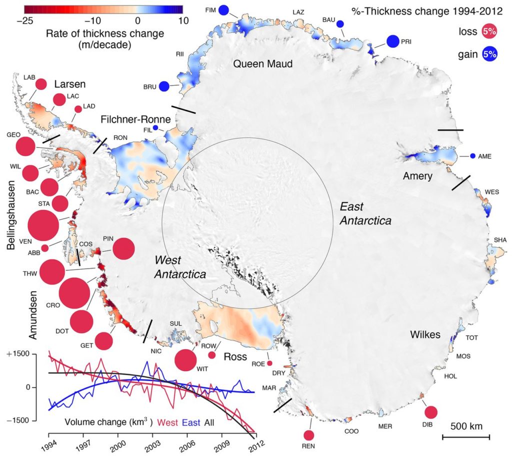
The total area of all Antarctica’s ice shelves is almost as large as the whole Greenland Ice Sheet and cover about 11% of Antarctica’s area. In other words, 11 % of the Antarctic Ice Sheet is floating! Figure 3 shows the Antarctic Ice Sheet where all ice shelves are shown in color. The colors correspond to their thickness change: red indicates strong thinning, blue indicates slight thickening. The circles associated with the different ice shelves show the percentage of thickness change.
Figure 3. Observed thickness changes of all ice sheets around the Antarctic Ice Sheet with colors showing the absolute change per decade and circles showing the relative change between 1994 and 2012. The total volume change of the Antarctic Ice Sheet, West Antarctic and East Antarctic are shown in the lower left corner. Source: Paolo et al., 2015.
Now you may think that there is a lot of blue color, so thickening of the ice shelves. It’s not so bad after all?! Only looking at the eastern part you are totally right! Many ice shelves have actually been thickening since 1994, which means they were growing! However, the largest mass change is happening in West Antarctic, where the colors are reddest and the circles largest. The small time line in the lower left corner compares the volume change of East Antarctica (blue) with West Antarctica (red). The western part has been losing mass since 1994, whereas the eastern part actually gained mass in the beginning until also the eastern part started losing mass in 2003. The black line is the total mass loss and you see that the volume went down continuously since 2003—so, West Antarctica wins in the end!
When talking about thinning of ice shelves, we always have to keep in mind that ice is almost as heavy as water; 9/10th of an ice shelf is therefore floating below the sea surface. This means that they are already part of the ocean and do not contribute much to sea level rise when they melt. But still, their role is to buttress the ice that is drained through ice streams—slow rivers of ice—from the interior towards the ocean. Thinning will therefore accelerate the ice flow further upstream in the grounded part and increase the ice sheet’s contribution to sea-level rise by acceleration and increased mass loss.